Welcome!

As part of my efforts to grow as an artist, I have launched this blogsite as an online journal. I am not too bad at editing so I hope I can keep it short and simple enough to head off boredom for readers. I appreciate feedback - so if readers have questions or suggestions, please send them along!

Monday, April 26, 2010

Sketch: Herring Gull


I am starting a new painting: a large (22" x 30" canvas) close-up of a herring gull. It is from a photo I took with my cell phone camera while I was walking along Stage Harbor last week. I have taken quite a few photos of these guys and my interest in them grows with each image. I caught this one standing at the waters edge... but as I started the sketch, I decided it would be a better composition if I put him deeper into the water a bit to capture some reflection of his legs and belly. So, the full-size painting will make the gull larger than life... an opportunity to work the detail of his eye and the texture of the feathers.

I created this sketch using oil pastels on a 9" x 12" canvas board which I pre-wet with medium (Galkyd Lite). I have never had instruction on using oil pastels, since (so far) I have only used them for preliminary sketches. Basically, I use the oil pastels straight out of the box, applying them like soft pastels. I use them "dry", drawing in the subject and applying local color, then modifying the local color with other hues scumbled on top. Then I dip a brush in turpenoid and gently "wash" over this oil pastel drawing to fill in the flecks of white and reduce or remove the "crayon" look.

I have found that the turpenoid is great for removing the oiliness of the top layer which, by the way, can remain undried for months! When I wash it with turpenoid, it dries "harder" somehow - and, of course, quicker. I have ruined some sketches by scrubbing too hard at a passage with the turp... killing the color. But a light coat, immediately blotted up, leaves the canvas board drier and ready for additional pigment, which stays true.

Another property of this medium that surprised me is that it appears to remain soluble in turpenoid forever! I may be exaggerating, but, compared to oil paint, where the only way changes can be made once a passage dries is to paint over it anew, no matter how much time has elapsed, it seems I can always scrub back into an oil pastel sketch with solvent. I find this really helpful, since I often only come to a conclusion about where I want to take my sketch after gazing it at for weeks.

This time, as I say, I laid in a layer of galkyd lite, then rubbed the oil pastel into the moistened canvas board. I am not sure what this will do to the seemingly endless solubility factor... but what I liked about it was that there was less of a "crayon" look right from the start; also, I was able to keep the color application thin for most of the image... then as I dabbed and moved the paint around, I achieved what I think is a nice, painterly effect.

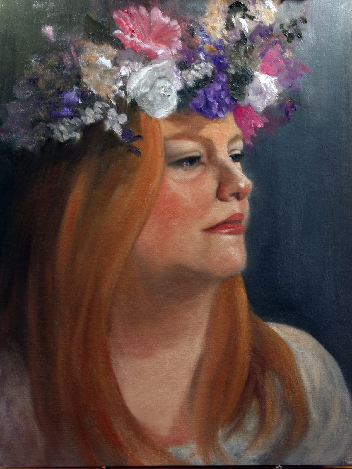
Until very recently, I never viewed my sketches as anything more than part of the planning for a painting. Frankly, I am not a disciplined planner at all. So often I launch right into an underpainting with no sketch or even thumbnail. I think I pay for that impulsiveness in the amount of rework I tend to do on the final painting. Even when I do plan, I have rarely gone beyond a charcoal drawing, focusing on resolving the compositional and value issues. I have found full color sketches helpful when I am painting something for which I have no visual reference. For example, my painting Companions II was an image that popped into my head. If I ever saw anything that stimulated that image in my mind, I did not recall it. So, to work out how I wanted to put the painting together, I needed more than just a value drawing.

When I have used full color sketches, I have discarded them as I would a thumbnail. In the course of our recent move to Cape Cod, though, I found that there were several oil pastel sketches "in process", so they got packed and shipped with all the other art materials. Once I unpacked, I placed these sketches around the studio... and lo and behold, I find a couple of them appealing. They are far more spontaneous and painterly than most of my finished works... and I like that.

This recognition has made me decide to treat these little bozzettos with honor. I will use them not just to work out the most obvious color and placement issues in a composition, but to capture the spirit of what moved me to paint the subject in the first place. Perhaps this will help me retain the freshness, energy and painterly qualities I strive for in my finished work.

Tuesday, April 20, 2010

The Right Color


"Painting is easy, you just put the right color in the right place." - Nelson Shanks

I have been painting in oil since the mid 90s... and I believe I learned at the feet of one of today's true masters, Wade Schuman. In Wade's studio I learned to use classic palettes. The Dead palette (the basic three-color palette of Rubens and Rembrandt, using only red, yellow, black and white), is a very liberating way to paint figures or portraits: using just these three colors... It helps you clearly see the simplicity and harmony of color relationships. Even with such a limited palette a full range of color can be found, and you can concentrate on painting itself, without the need to juggle your attention on so many elements of your painting. I still use this palette sometimes - usually for portraits.

Another "old masters" palette I learned from Wade was the Neapolitan palette, which is done on a dark ground. I have only used this twice - once being as part of the atelier work in Wade's studio, but I found it a most exciting way to paint. Painting with this method calls for a canvas prepared with a dark red ground (burnt umber, burnt sienna and white gesso). The painting palette consists of what Wade referred to as an "extended earth palette": Transparent oxide red, raw sienna, yellow ochre, flesh ochre, raw umber, burnt umber, sepia extra, ivory black and cold black, and including two "prismatic" colors: Ultramarine blue and alizarin crimson.

Basically, you start by drawing in your basic forms and shadow mass with sepia extra, then you add the light mass and background colors using the extended earth palette and keeping the colors high key. You use the prismatic colors for glazing over intense local color as needed... What is amazing about this method is how quickly you see a fully resolved image. (Me thinks I will try it again soon!).

Then we come to the "full color palette." This is where things become less clear, and where Nelson Shanks' comment rings most resonant. Here we are in the 21st century, inheritors of 500 years of oil painting experience and technical developments that leaves us with an abundance of oil paints and painting materials. I guess that explains the overwhelming array of colors available in most art stores... A brilliant medley that makes me want one of everything! But also leaves me wondering if facing so many possibilities (of colors to choose for your palette) can be too much of a good thing.

I have read that studies show that when faced with two dozen varieties of jam in a grocery store, for example (or lots of options in an art shop?), people often choose arbitrarily or walk away without making any choice at all, rather than labor to make a choice. I have found that as I read or attended workshops, I never came across the same palette preference (on the part of the instructor) twice. For example, here are three full color palettes from three respected contemporary artists:

Bo Bartlett: Alizarin Crimson, Burnt Sienna, Cadmium Red Med., Cadmium Orange, Cadmium Yellow, Yellow Ochre, Cadmium Green, Raw Umber, Cobalt Blue, Ultramarine Blue, Cobalt Violet

Richard Scmidt: Cadmium Lemon, Cadmium Yellow Pale, Cadmium Yellow Deep, Yellow Ochre, Cadmium Red, Terra Rosa, Alizarin Crimson, Transparent Oxide Red, Viridian, Cobalt Blue Light, Ultramarine Blue Deep

David Leffel: Naples Yellow, Yellow Ochre, Venetian Red, Cadmium Yellow Deep, Cadmium Yellow Light, Cadmium Red Light, Cobalt Blue, Ultramarine Blue, Burnt Umber, Ivory Black

When it comes to choosing colors for your palette... how do you decide? You love the work of a particular artist, so you try working in her palette. But is that it? Do you imprint on that palette? Or do you explore? There are so many aspects to it: what you are painting (e.g., landscape v animal fur v human portrait) ... what appeals to you... and perhaps most importantly, how the colors behave together.

I don't pretend to be knowledgeable about the chemistry of oil paints, but I do have a profound respect for how much chemistry determines the interactions of the colors. (Just try mixing vermillion with cobalt blue for example... and compare that to cadmium red light mixed with cobalt blue. Most of us, viewing a dollop of cad red light and vermillion next to each other would see them as extremely similar colors. But boy, do they behave differently!) So you have a matrix of considerations at play... how do you choose?

I would love to hear from someone who struggled with this and came to a choice that is truly theirs.

Wednesday, April 14, 2010

The Finish Line


After what seems like interminable perseverating (I will have to consider whether this phrase is hopelessly redundant later...) I am at last ready to declare this portrait completed.

Although I am not always plagued with this difficulty, I often do have trouble recognizing when I have finished a painting. As with this effort, I end up repainting parts over and over again... Often when I get in that spot, it feels as though I am in a thicket surrounded by shrubbery taller than me... and I can't see my way out. (A pretty obvious forest-for-the-trees analogy). I know that the right thing to do then is to step away - physically, step back... and even move away in the space of time. Simply put the painting away and not look at it for a while... I know that is the right thing to do... so why, all to often, do I not do it, at least not before the weight of frustration has all but crushed me?

I understand I am not alone in this struggle... apparently Pierre Bonnard was famous for reworking his paintings both in the studio and after delivery, including once having his friend Vuillard distract a guard in the Louvre so he could add a few brush strokes to a hanging painting of his! I promise that if I get in the Louvre, I will not try to guild the lily!

With this painting, I believe my stumbling block was the fact that I had no model, no image to work from. Oh, I had a reference photo- but one with significant challenges to overcome (e.g., flash that flattened the faces). I was painting not to try to represent something I was seeing, but to compensate for it.

So what lesson have I learned from this painting - fraught with too much struggle and no clear end in sight? I learned what every teacher I ever worked with had urged: I should have made a complete drawing (not just a couple of sketches). In this case, possibly even a full color painting to work through the problems... then I could have painted from THAT as a reference I could rely on.

You can bet I will not tackle another such challenge - working from imperfect photography - without drawing on this valuable lesson truly (and at long last) learned!

Monday, April 12, 2010

Feathers


The last few days here on Cape Cod have seen a continued onslaught of Spring in all its beauty. Hesitant, (we have only daffodils and forsythia, with just a hint of buds on willows and other intrepid early-bird plant life) but definitely HERE! Despite the chilly nights (we are going to have frost tonight), the tree frogs are serenading every night. And of course, the birds.

Although we have owned our home here for more than 25 years, we have visited mostly in late summer. I have never had the chance to experience a spring on Cape Cod. For anyone interested in birds, it is a miracle. Cape Cod apparently is on an important migration flyway, and is redolent with birds passing through at this time of year. And the signs are everywhere, among permanent avian residents as well as migrants. Bird song has increased in volume and "musicality". Their behavior has changed, as well: birds that got along together at the feeder all winter are now chasing each other away.

And then their is the plumage... one of the most obvious changes is seen in the Goldfinch, which are now brilliant chartreuse. But everyone seems to have brightened and become more definitely themselves, in honor of Spring.

I have been drawn to painting animals from the time I started painting in the early 90s. Studying in the atelier of Wade Schuman, gave me the opportunity to paint taxidermic or - squeamish alert! - frozen specimens. Wade has an impressive collection of specimens, since he paints only from life (no photos), and chooses to include small animals, birds or insects in many of his magnificent paintings. Not only did this studio work improve my skill and appreciation of technique, it also captured my imagination and spoke to my particular love of animals and birds.

Over the years, I have also picked up a few specimens... careful to avoid abuses and risky practices in the world of taxidermy (re: unlawful harvesting of some species). For example, I got a wonderful American Crow that was sold from the collection of undisplayed dioramas at the Elmyra Museum. That fellow is the centerpiece of my Still Life With Crow http://www.janinekilty.com/large-view/Still%20Life/198017-3-0-916/Painting/Oil/Still%20Life.html

I have found that working from an actual specimen has made me understand and appreciate the structure and appearance of feathers in a way that photos could never have done. Seeing the bird close up, in true light, allows the artist to distinguish soft, "fur like" feathers, like those found on an Eclectus parrot or Ant Pitta http://www.janinekilty.com/large-view/Animal%20Tales/31602-12-6-885/Painting/Oil/Animals.html, from the sculpted feathers, large and small, on a bird such as the crow. It reveals how the feathers change in direct light, reflected light and shadow... and what the colors look like in these states of light. For sample, my friend, the crow, actually has no black in his "black" feathers! His feathers are sumptuous blend of browns, purples, blues, burgundies... yet how black he looks!

I think I have worked myself up into a mood to tackle another bird specimen: shall I do the jay, like the one shown here (from a taxidermy specimen from Lithuania)? Or a European starling?

Friday, April 2, 2010

Art and Golf


Spring. Renewal. Energy. Creativity. Communion. Golf.

Golf? Oh, Janine, you're not really going to write about a sport in this essay are you? Or is this an instance of "One of these things doesn't belong here" lists? No. Golf belongs on that list. Amazingly in my convoluted consciousness, they are related.

I am relishing the arrival of Spring here on Cape Cod... the birdsong is deafening... the air really and truly sweet. So my thoughts turn to Spring and painting, creating. And then Golf. Here is how...

In Steven Pressfield's The Legend of Bagger Vance, Bagger Vance is a mysterious caddy who appears to help Junah, a gifted but struggling young golfer who has lost his swing. Early in the critical match, Vance show Junah "The Field." Vance waves his hand at the course and says "This is the Field," it is the field of play. And he says to Junah, "You are the Knower. All that IS flows from the union of the Field and The Knower." Bagger Vance shows Junah how Jones, an older, more experienced golfer, tunes into the Field before he even approaches the ball. Around Jones, encompassing his body in vibrating concentric fields, spreads an aura of energy. It seemed to be his body, but expanded, augmented. It was a field itself. You could see his will," as Bagger Vance said, "His intention, select the Field he chose, which was the fairway and the target." He describes how Jones has a thousand swings in him, but how, through his intention, he sifts through them all until he finds his perfect swing.

The power of intention. There have been many explorations over the years, ranging from Peale's The Power of Positive Thinking to Julia Cameron's The Artistis Way, to Rhond Byrne's The Secret, of the power of intentional thinking.
Healthy, positive thinking can be bring you vitality: repeatedly creating thoughts that keep one's mind and body in balance. Think inadequacy [even if what you are thinking is a wish to avoid the inadequacy!] and you may ultimately fail to perform in an adequate manner. Think defeat and you will tend to create the circumstances that lead to defeat. But think victory and success, really think it, then you will perform in such a manner that will lead to such an outcome.

This is not "wishful thinking." It is belief in what you are doing, and focus. Focus that puts you IN your vision and your intention. It is Prayer as meditation. Prayer releases power. Prayer also keeps you humble and helps you keep perspective.

Because I remember, too, what Bagger Vance tells Junah when he is worried about the outcome of his efforts "It's only a game. A game you can't win. You can only play."

Happy creating!